

Color Math
Do you know your creative formula?
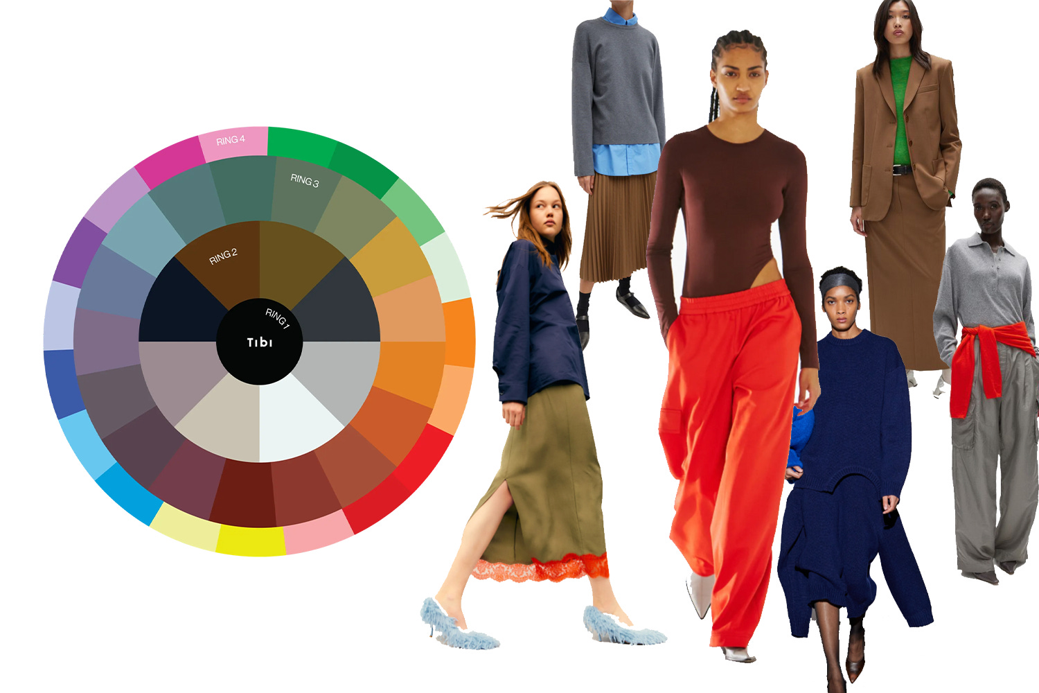
Last week, I was introduced to Tibi’s color wheel, a visual guide on developing an outfit that pulls from different layers of the wheel (see below) to build a “vibe”.
Ring 1 = black; ring 2 = neutrals; ring 3 = “no-color colors;” ring 4 = bold colors. Each ring has a hue and an associated guiding principle. The further apart the colors, “the stronger rigor the vibes have.” “Rings 2 + 3 = 4 (chic and clever).” “Rings 1 +2 = urban minimalist.” The color wheel is a pillar of Tibi’s creative direction, but it’s based on something even deeper and more compelling – CP Color Math.
CP is short for creative pragmatist. The general concept, according to Tibi founder Amy Smilovic, is that a CP has a deep understanding of who they are as a person, and intuitively can use that as a foundation in presenting themselves to the world through fashion, interior design, art, music, sneakers, flowers, etc.
Smilovic describes finding a good outfit using CP color math as “settling” and being in-step with yourself. It’s a congruency that psychologists would probably call the “self-image.” Being a CP “lies in your ability to demonstrate that you are a complex, thinking individual who is grounded and understands fundamentally who you are.”
I interpret this as a sort of aesthetic ikigai, where who you are and what you like come together. This is why it’s incredibly rewarding to study an artist’s body of work – the subject matter or color schemes may vary, but the general aura of the work stays congruent with the artist. As Michael Schein wrote, “Creativity is not about coming up with new ideas from scratch, it’s about combining divergent concepts in ways that no one has thought of yet.” This leads us down the path of the creative identity formula.
In most artistic processes, formulas seem to work. Pop songs are written with the same four chords (C + G + A minor + F). Artists are often taught to practice building a palette with the same colors at the start of every session (titanium white + cadmium red + burnt umber + cadmium yellow + ultramarine) and use a limited color palette as an exercise in hue.
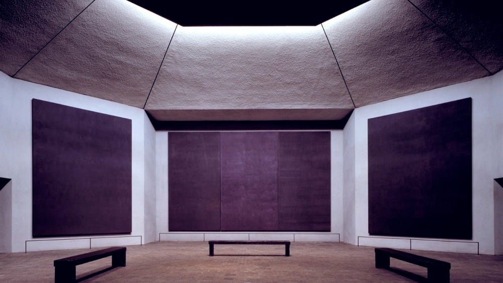
In 1958, Mark Rothko gave a lecture at the Pratt Institute titled “The Formula” which provided an ideological guide in his own painting practice. Like the tortured artist he was, it included steps such as “There must be a clear preoccupation with death,” and “Hope. 10% to make the tragic concept more endurable.”
Other steps in his hit list are frankly unexceptional but useful nonetheless; these key concepts like “tension” and “wit and play” are strong pillars of art theory. Rothko had an emotional formula for his work, which was incredibly effective. He was extremely specific in how he wanted his work to be seen, and by curating the scale and aura of a gallery we get places like the Rothko Chapel which is often regarded as an artistic shrine. Abstraction + existentialism + scale = Mark Rothko.
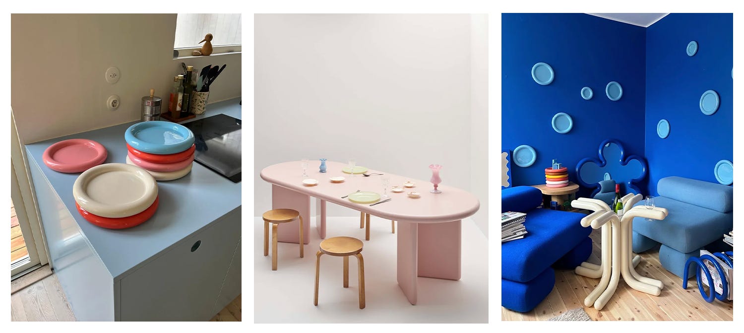
We have come to develop a desire to distill ourselves into an equation because it’s a shortcut to reduce decision fatigue and self-analysis. We know what works. Shiny + Rave + Editorial = brat (Charli xcx). Bulbous + color + utility = Gustaf Westman (see above).
Maybe most famously, dots + repetition + perspective = Yayoi Kusama. Kusama notoriously struggled to be understood and seen by the institutional art world at the beginning of her career, even though her work was productively subversive and groundbreaking in the ‘50s and ‘60s. The film Kusama - Infinity documents how tenaciously pursuing your creative truth succeeds and produces great art.
CP Color Math is a movement to fight the idea that “personality [has been] lost to personal branding and personal style.” The most successful creatives pull from their own equation of sorts. To know what you like is to know who you are. Even if your skill is constantly catching up with your taste, at least you know what you want.
A formula provides comforting guard rails to play in the constraints of our own visual identity. It couldn’t hurt to use this as an exercise for your creative practice, right? Draw from the well of your own developed personhood. On the other hand, maybe we should all just think about ourselves a little less.
Available Artwork
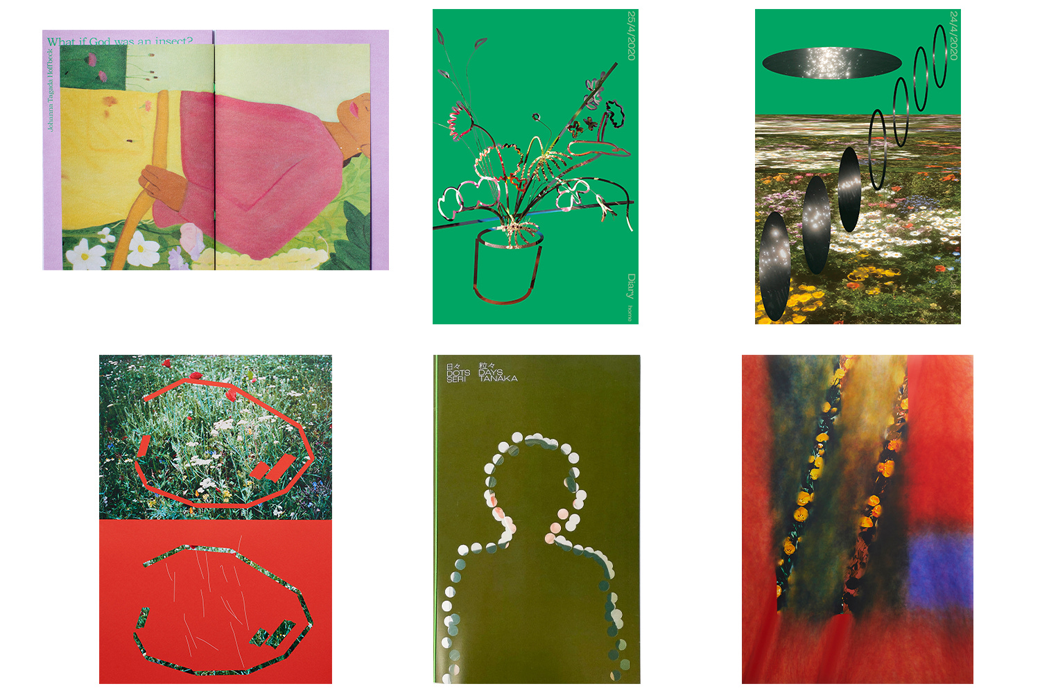
Seri Tanaka is an award-winning Japanese graphic designer and art director. She’s designed for a myriad of interesting brands and the Mori Art Museum. I was magnetically drawn to her work which I found on Pinterest about a year ago, obsessing over the way she uses negative space and pattern (her gap posters sealed the deal for me!). Her work is about balance + scale + transcendentalism.
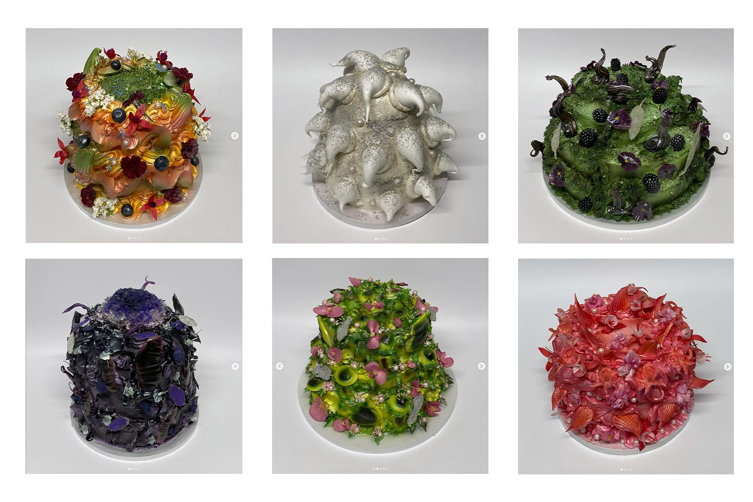
If Rust Cakes had a formula, it would be a dance between subversion + texture + play. Hana, the creator behind Rust Cakes, takes something traditionally embellished and perhaps a bit boring and makes colorful, shocking, and compelling works of art. Art thrives under constraint, and putting together spectacular micro-worlds on a sponge cake before the icing melts is certainly a unique restriction.
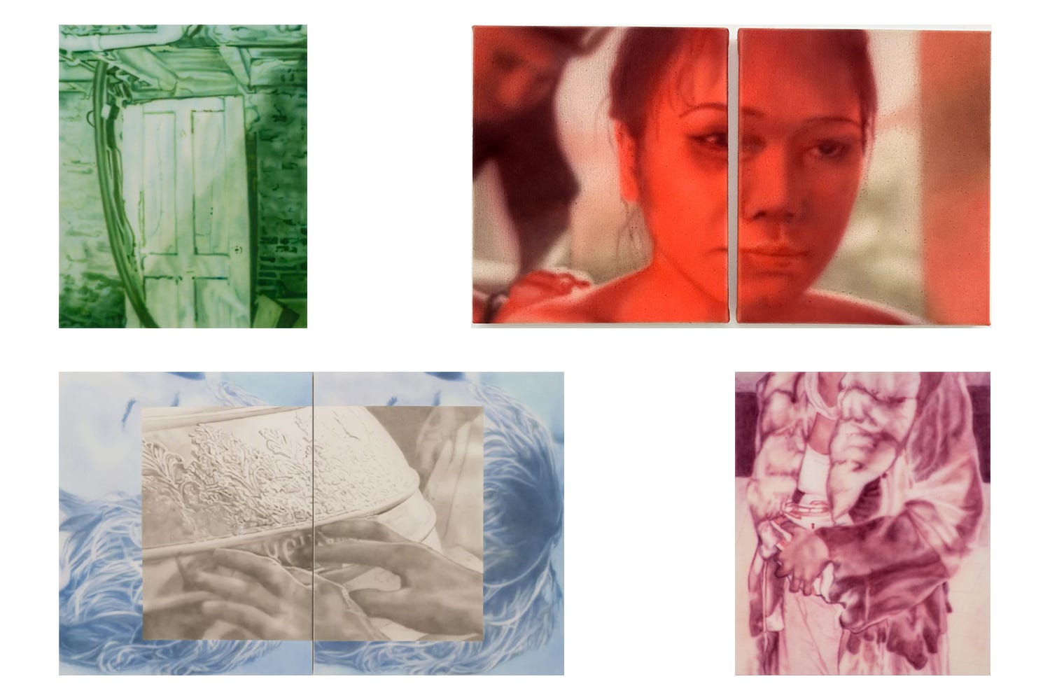
Lisa Liljeström’s equation is fleeting + soft + monochromatic saturation. She primarily uses airbrush to produce a tender and fuzzy texture to capture charged moments. Her use of color is disarming and extremely engaging. Liljeström is included in an upcoming show at Galleri Golsa, which any Oslo locals should check out.
Really enjoyed reading this